NOTE: New Library Layout applies to all Scrible users, but all other changes apply only to Scrible Edu Pro users.
Out with the old and in with the new! We’ve made major changes to make our Library interface more intuitive, with a better design and layout. We’ve also added powerful new features. Check out our new transition video above to guide you through the changes!
OVERVIEW
Previously, navigating between separate Libraries and the components of a project (i.e. its Library, Bibliography, Legend, Collaborators, etc.) required too many clicks. Based on your feedback, we’ve eliminated much of that and simplified the layout and navigation of Libraries and project components. We took the opportunity to also make other improvements to Libraries. Details are below, but here’s a summary of the changes:
Library Improvements
• Standardized Libraries – All libraries have all of the same features now.
• New Library Layout – The Library fills more of the page, is less boxy, has new/updated buttons and more.
• Projects → Libraries – The Library (vs. a Project) is once again the main, top-level organizing concept.
• Project Dashboard → Library Tabs – Panels in the old Project Dashboard are now tabs atop the Library.
• Projects Page → Libraries List – You now have a Libraries List at the left vs. a separate page of projects.
• Class Library Changes – Class Libraries are no longer special things. You can add classes to any library.
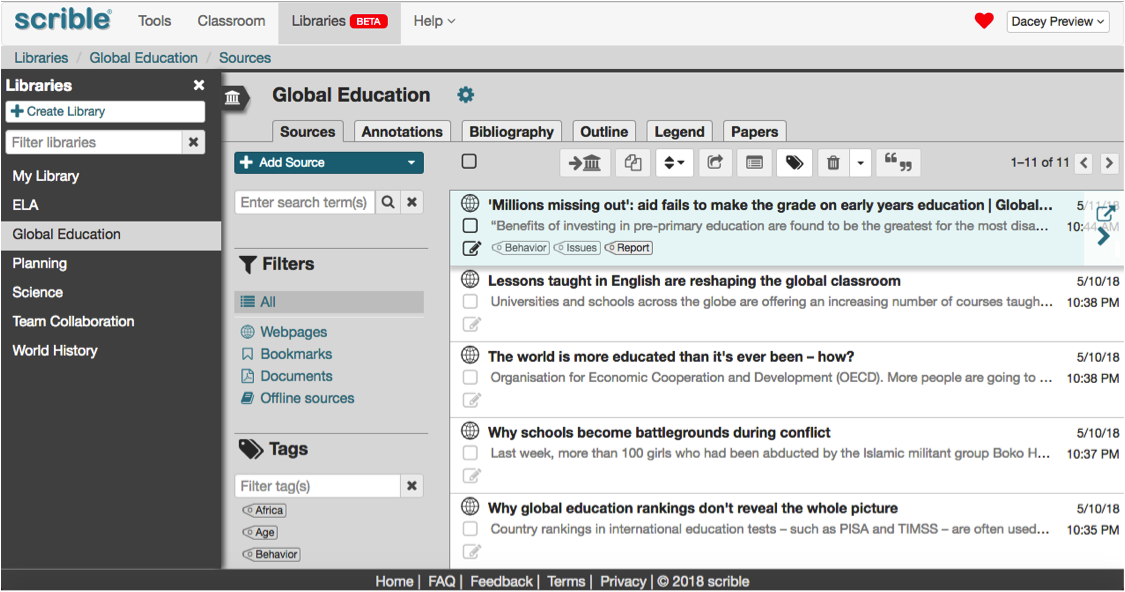
• Annotations List – Click on a source (article) in your library to see a list of annotations for that source.
We’ve also added awesome new features! Again, details are below, but here’s the summary:
New Features
• Annotation Tagging – Organize (tag) your evidence/comments (annotations), not just sources (articles).
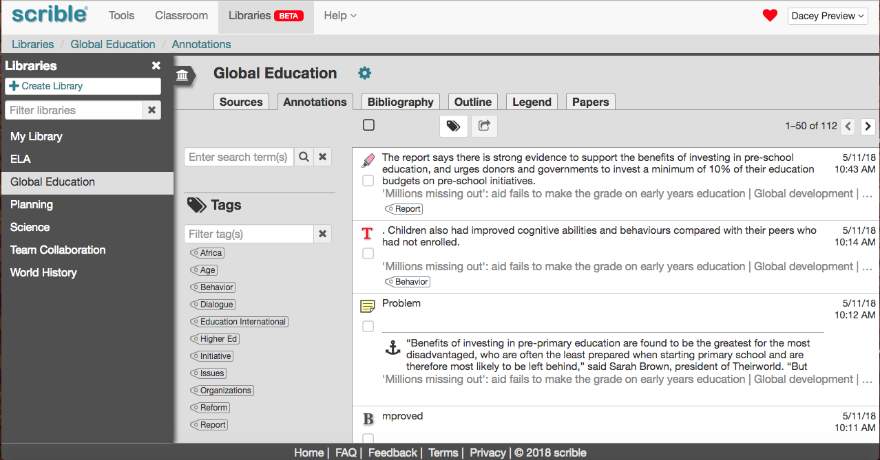
• Annotations Tab – View and full-text search your annotations in a new Annotations Tab in the Library.
• Smart Outline – Drag/drop annotations into an outline. It auto numbers and updates your bibliography!
DETAILS
Library Improvements
Standardized Libraries
Previously, My Library lacked some features available in other libraries. Now, libraries are standardized so that all libraries have all the same features. That simplifies things!
New Library Layout
The new Library layout wastes less space since it fills more of the page. It’s also less boxy, with a more modern, continuous layout. It also looks and feels more like a robust desktop application. Nice!
Projects → Libraries
The library (vs. project) is once again the central organizing concept. So, there’s no longer a Projects Tab at the top. The contents of that tab have been absorbed into the new Libraries Tab, which now encompasses all components of a project.
Project Dashboard → Library Tabs
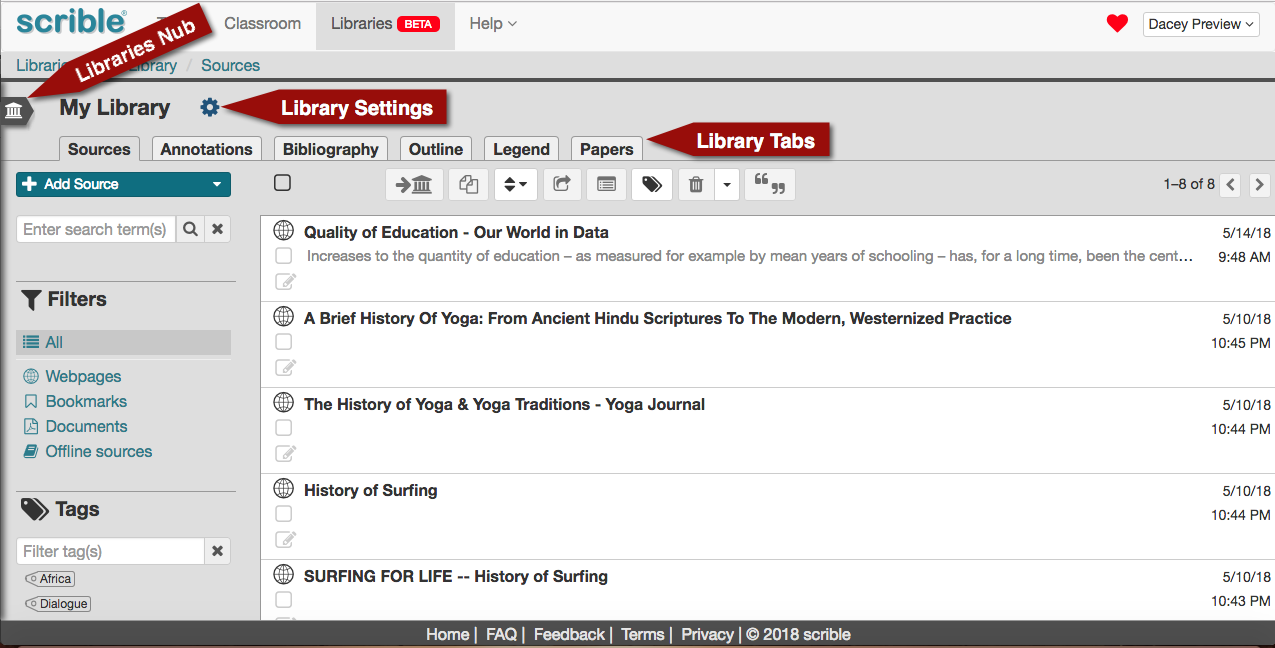
The always visible Library Tabs now provide easy access to the various components of a project (e.g. Bibliography, Legend, Papers) that were previously displayed as panels in the previous (now defunct) Project Dashboard. The old Collaborators Panel is now the Collaborators Tab under Library Settings. Library Settings are accessible via the new gear icon to the right of the library name. Use this to invite/add collaborators to your library.
Projects Page → Libraries List
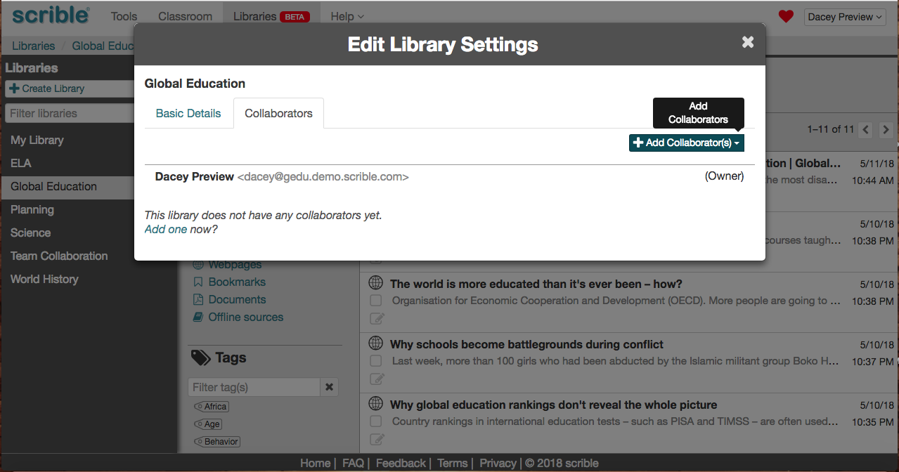
The Libraries Nub to the left of the library name can be toggled to show/hide the Libraries List, which serves the same purpose as the previous (now defunct) Projects Page. The Libraries List displays all of your libraries, including libraries you own and shared with others as well as libraries others have shared with you. The previous concept of a Project Library is now just a library in this Libraries List. So now, just treat, designate and think of each such library as a separate project.
You can now easily move a source (e.g. article) from the library you’re currently viewing to another one simply by dragging and dropping it to that destination library’s name in the Libraries List. So easy!
Class Library Changes
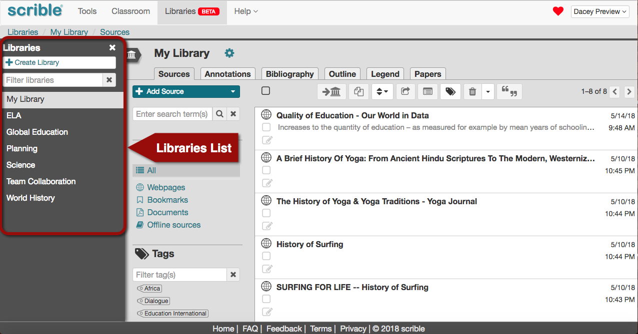
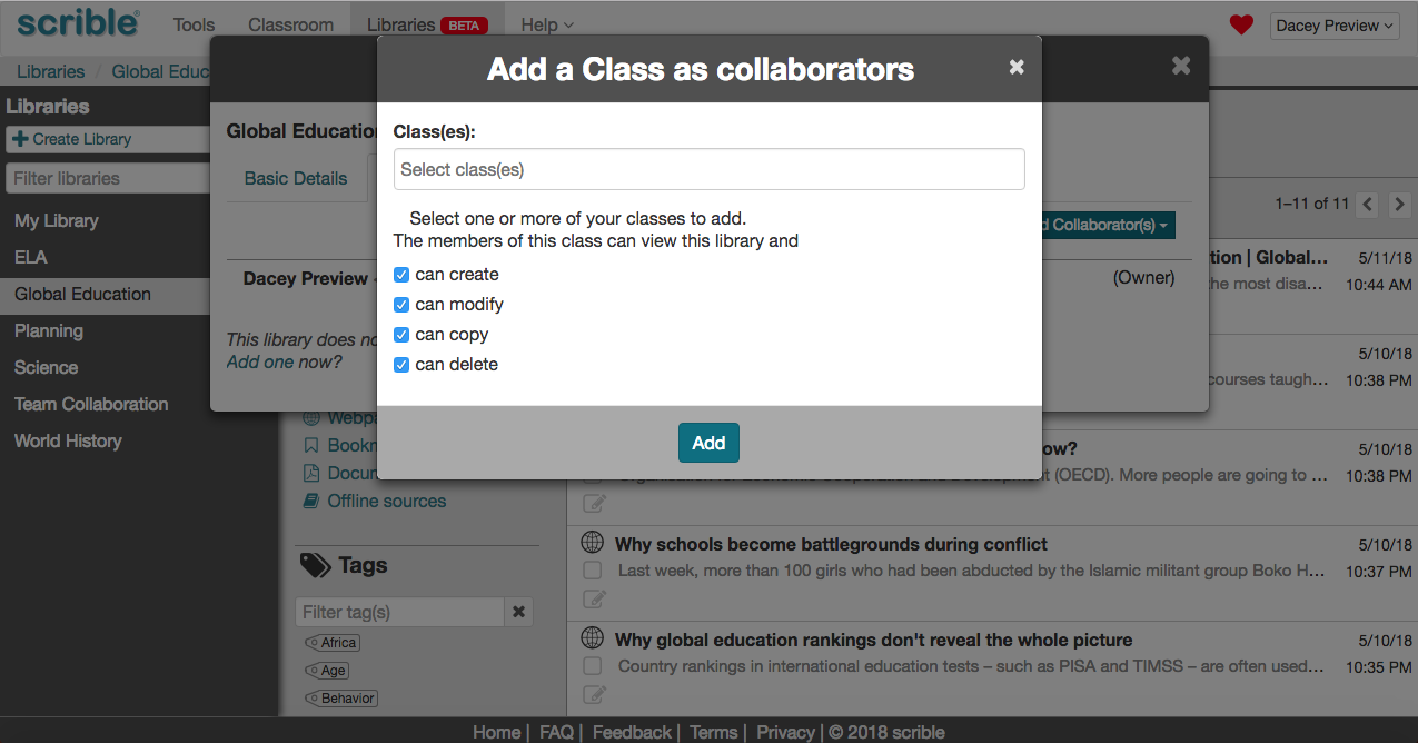
Since this Libraries List is comprehensive, we’ve done away with the concept of a separate/special Class Library, which previously appeared in the Libraries Tab (now gone) under the top-level Classroom Tab. A Class Library was autogenerated every time you created a class. Instead, now, you can just add a class to any library and it becomes a class library. Magic!
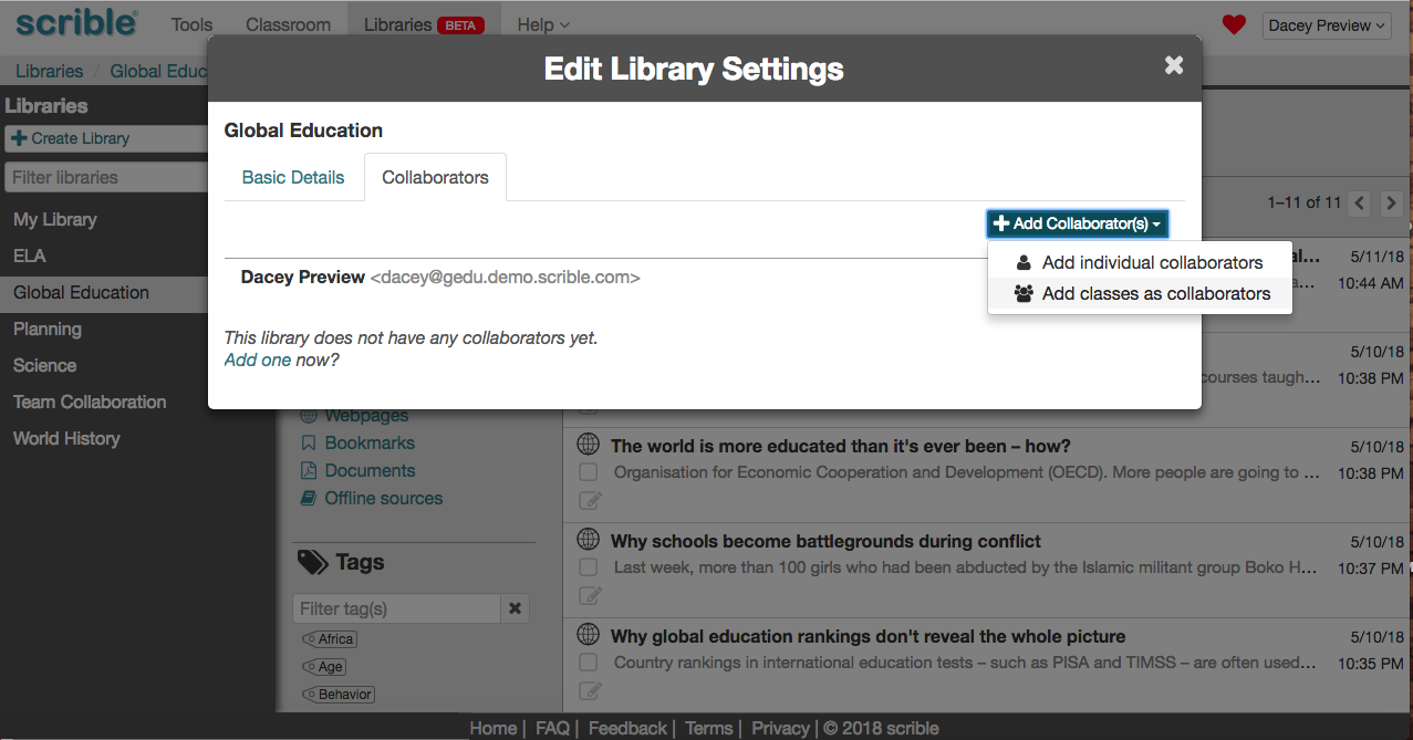
Like before, you can still manage the permissions that a class has for a library.
Annotations List
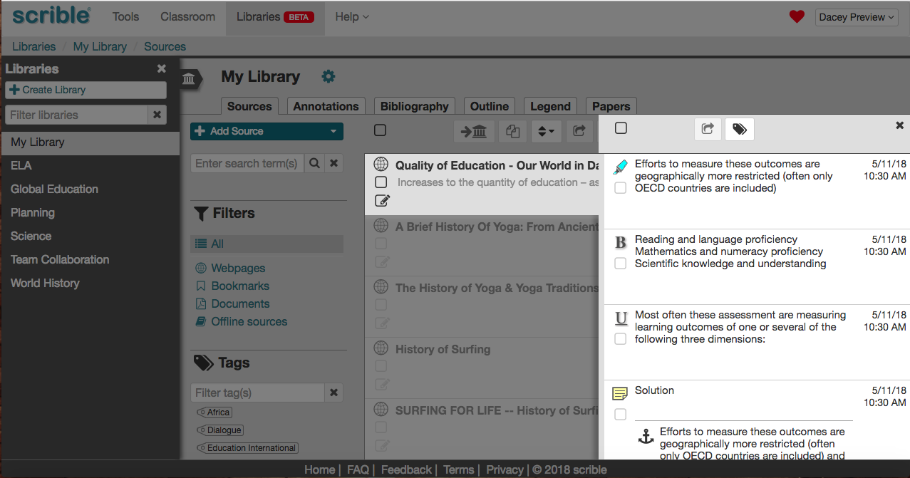
A new Annotations List feature allows you to see all annotations for a selected source (e.g. article) in the library. Click the arrow at the right end of a source in the Sources Tab of a library to browse its annotations. That slides out the Annotations List from the right, which lists the annotations for that source. From there, you can share an annotation, manage its tags, view it in full form in the Library and open the source (e.g. article) to view the annotation in its original context.
New Features
Annotation Tagging
You can now tag specific annotations (e.g. highlighted evidence and comments), not just sources (e.g. articles). When you’ve annotated a source (e.g. a webpage or PDF), you can tag the annotations right then and there. For highlights, underlines and other text style annotations, click on the annotation to view its Annotation Context Menu and then click the tag icon in the Menu. For comments, just click the tag icon shown below the timestamp in the title area of the comment.
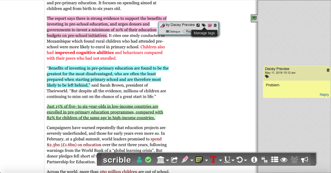
This brings up the Annotation Tags Window, which you can use to add and remove tags for the selected annotation.
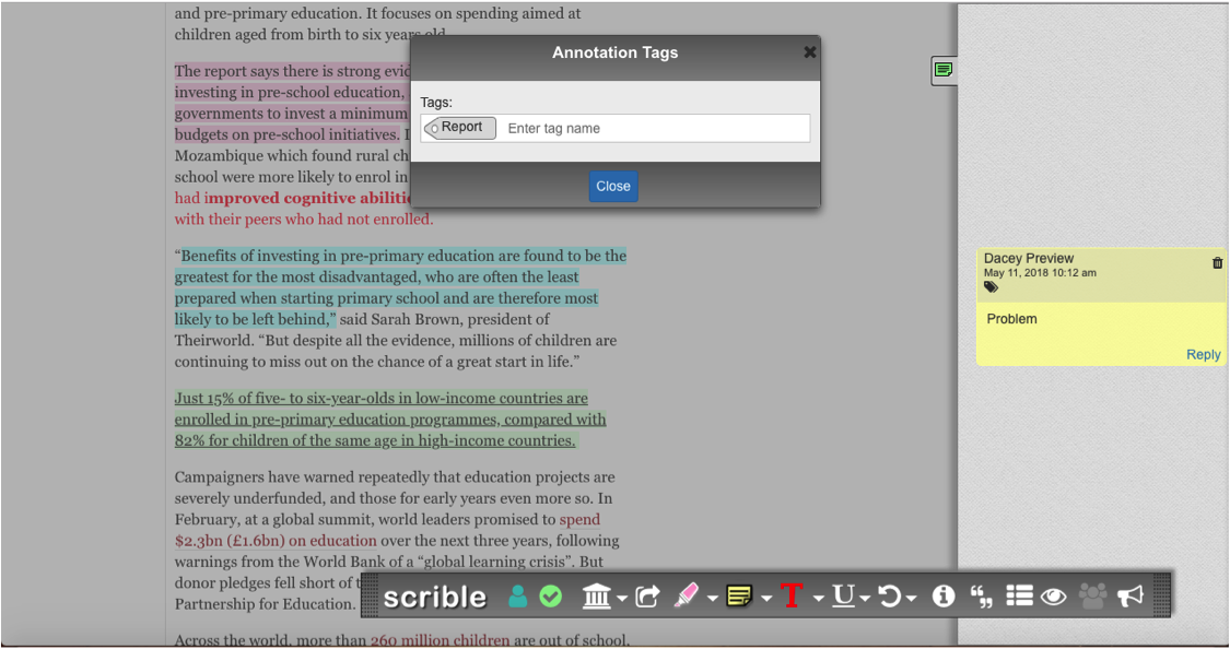
Tags applied to annotations roll up to the encompassing source. So, in the example shown here, where the tag Report, is added to the pink highlight in the article titled, ‘Millions missing out’: aid fails…, viewing the article in the Library later shows the same tag applied to the article as a whole.
Annotations Tab
Under the new Annotations Tab in the Library, you can view, browse, full-text search, tag and filter all of your annotations across all sources in your library. This gives you more granularity in organizing your information… at the evidence and comment (i.e. annotation) level and not just at the article (i.e. source) level.
Smart Outline
Our new Smart Outline appears under the Outline Tab in the Library. Here, your sources and annotations are accessible via the Library Sidebar on the right hand side. Click on the arrow at the right edge of a source to dig a level deeper and browse its annotations. Alternatively, use the search field to search the library for relevant annotations.
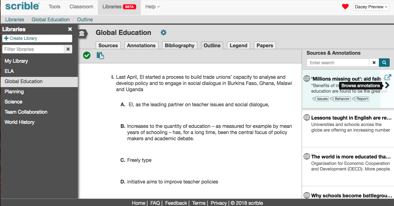
In either case, once annotations are visible in the Library Sidebar, you can drag them leftward and drop them into the body of the outline. Each added item’s corresponding source is automagically added to your bibliography and the corresponding inline parenthetical citation is shown below the item in the outline (not illustrated here).
Each added item is automatically numbered according to its location in the outline hierarchy. Hovering over any item displays icons to the left allowing you to delete the item, add a subsequent item at the same level, indent/outdent the item or drag it to another location in the outline. If you drag it, you’ll see a preview of its new number as it’s being dragged. Whether you indent, outdent or drag and drop an item, its number in the outline is automatically updated. Sweet!
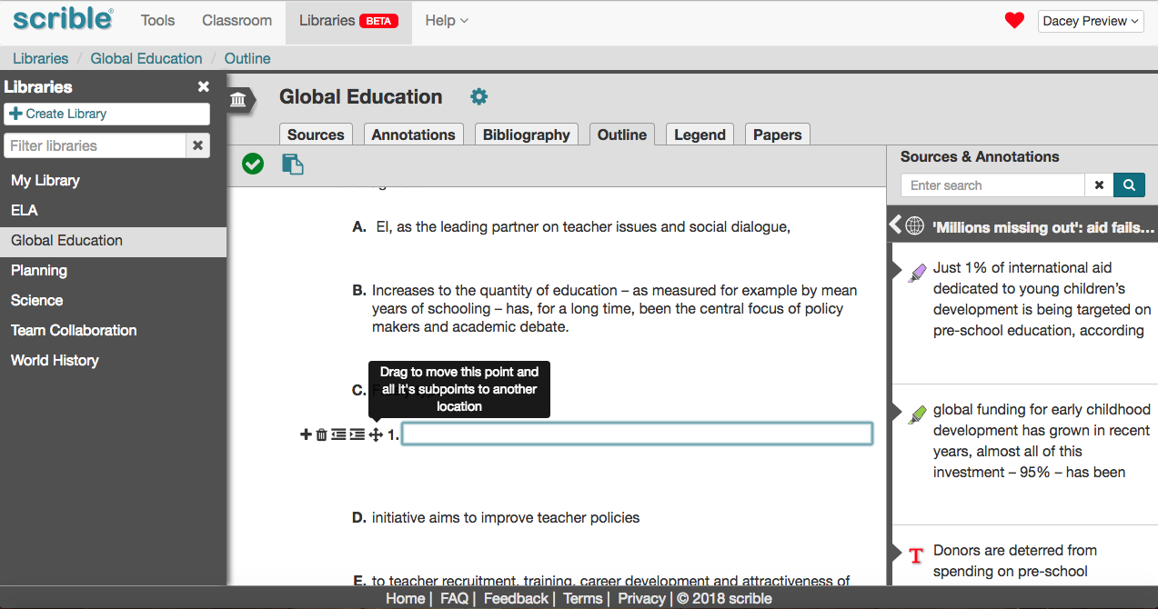
You can edit/tweak the item’s text as needed. You can also just type your own thoughts into the field for an item in the outline. The outline can later be copied and pasted into a document.
So that’s the new Scrible! You can always refer to the video above to see the changes and new features in action. We’ll be updating our training and support materials to reflect them. If you like the new stuff or if you stumble upon any problems or have any questions, please let us know! We’re always here to help!
– The Scrible Team


