


We’ve given the Scrible Library a makeover and made other improvements throughout the system!
Updated Design
In addition to an overall move to a brighter, white interface, we’ve made dozens of smaller changes to buttons, fields, messages, windows, tooltips, icons and layout for design consistency to give the Scrible Library a more modern look and feel. We’ve also made numerous improvements to give the Scrible Toolbar and accompanying On-Page Sidebars more breathing room (e.g. more padding/spacing in dropdown menus) and make them easier on the eye (e.g. larger color swatches and text size in dropdown menus).
Consolidated Library Sidebars
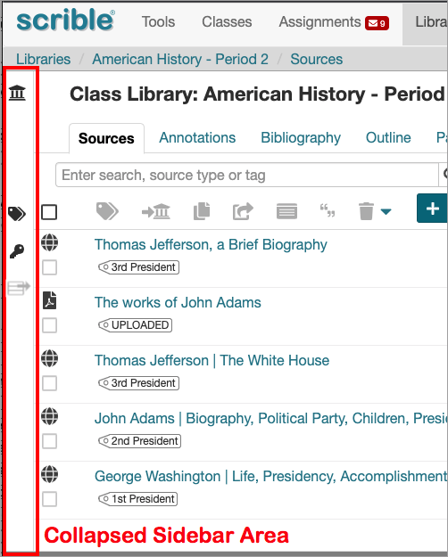
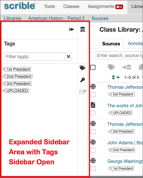
We now have a single sidebar area on the left of the Library to display each of the available sidebars (Libraries, Tags and Annotation Key) one at a time since there’s no great need to have two of them open simultaneously. This simplifies the interface and eliminates the previously possible busy layout in which you could have the Libraries Sidebar open on the left and the Tags Sidebar or Annotation Key Sidebar open to its right. Now, each of those is only viewable one at a time. All sidebars can be collapsed when not needed to give you more screen space to view the contents of your Library.
New Add from Sources Sidebar and Button
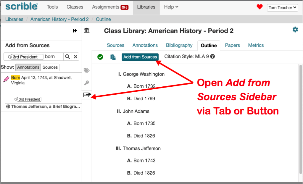
Under the Bibliography Tab and Outline Tab, there used to be a Sources Sidebar on the right that would display your sources and allow you to add citations to your bibliography and annotations (e.g. highlighted evidence) to your outline, respectively. That sidebar now appears on the left as the new Add from Sources Sidebar. It still works the same way. It’s just folded into the new consolidated sidebars area on the left. When you’re in the Bibliography Tab or Outline Tab, you can open/close this Sidebar using its own tab. When its closed, you can also open it by clicking the new Add from Sources Button.
Source Description Back in the Library
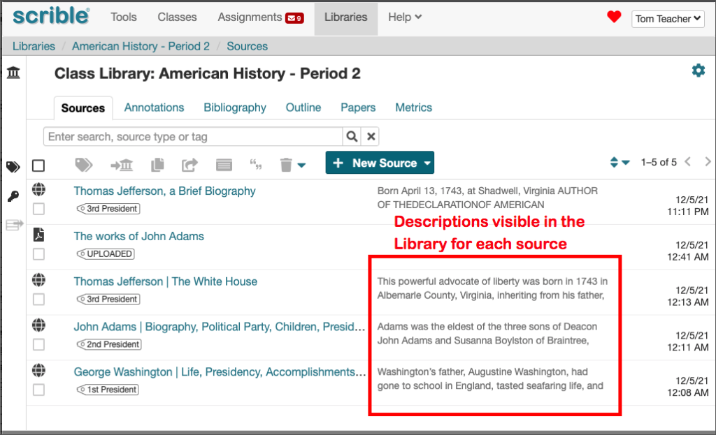
We’ve brought the Source Description back to the Library so you can see a brief helpful blurb about each source there. These descriptions have always been available, but were not displayed alongside each source in the Library.
Remember that you can enter/edit the description for a source in 2 places – in your Library and in the Information Sidebar on a source (e.g. webpage or PDF). In your Library, click the Information Icon at far right of the source entry to display the Information Window, where you can enter/edit the description. When viewing a source, click the Information Sidebar Tab on the right to view the Information Sidebar, where you can also change the description field.
You can enter your own description for webpages and PDFs. We automatically provide one for books. When there’s no description, we show a preview of the first annotation (if there is one) in place of the description.
Flipped Citation Editor Layout
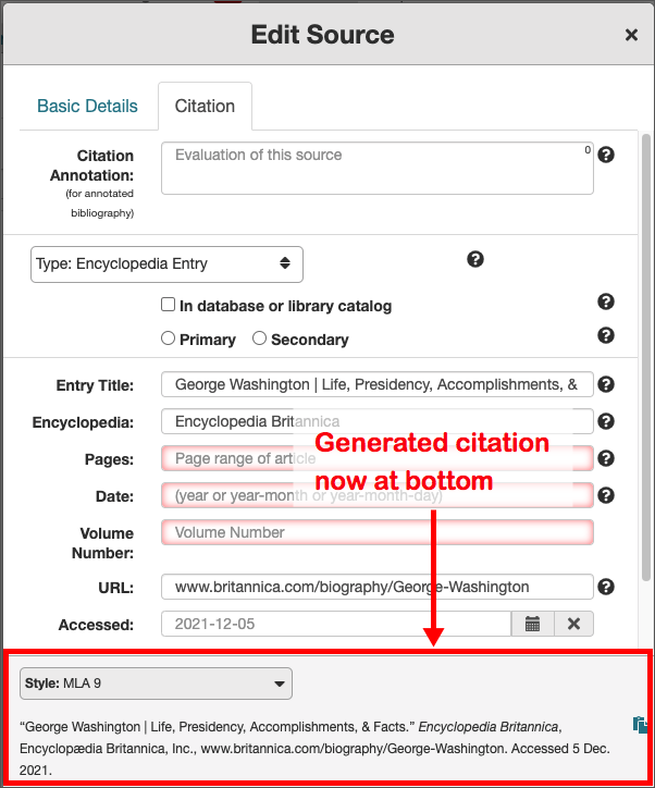
The Citation Editor layout has also been updated. The autogenerated citation is now found at the bottom and the the constituent fields that make up the citation are at the top. This is intended to draw your attention to those fields so that you’re more likely to check them and see if they require your attention. We hope that helps build the good habit of double checking the fields to ensure citation accuracy.
Remember that the Citation Editor is viewable in multiple ways, including (a) by clicking the Citation Icon at the far right of a source entry in the Library, (b) by clicking the Citation Icon to the left of a citation in your bibliography in the Bibliography Tab and (c) in the On-Page Citation Sidebar when viewing a source.
Updated Browser Extension Button
The buttons for our Chrome and Edge browser extensions are now updated to a teal color that matches our current logo and is frequently used throughout our interfaces. If yours hasn’t changed yet, it should automatically update in the next few days. New button color; same great features!
New On-Page Sidebar Tabs Panel
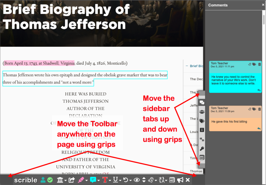
The tabs for sidebars that accompany the Toolbar on right side of a webpage and in our PDF Viewer are now all visually grouped together in a single panel. On a webpage, this panel can be moved up and down using a grip area at the top and bottom of the panel in case it’s blocking underlying content.
You’ve always been able to move the Toolbar on webpages using the grips on either end.
Updated PDF Page Zoom and Navigation Controls
In our PDF viewer, we’ve consolidated the page zoom options in the Toolbar into a single dropdown menu and moved the page navigation controls to the Pages Sidebar (f.k.a. Thumbnails Sidebar). This declutters the Toolbar a bit and sensibly unifies page navigation with page thumbnails.

Page zoom and navigation controls updated in the Scrible PDF Viewer
We hope you like the makeover and that it helps you work more efficiently and effectively. As always, if you have any questions or run into any problems, please let us know!


